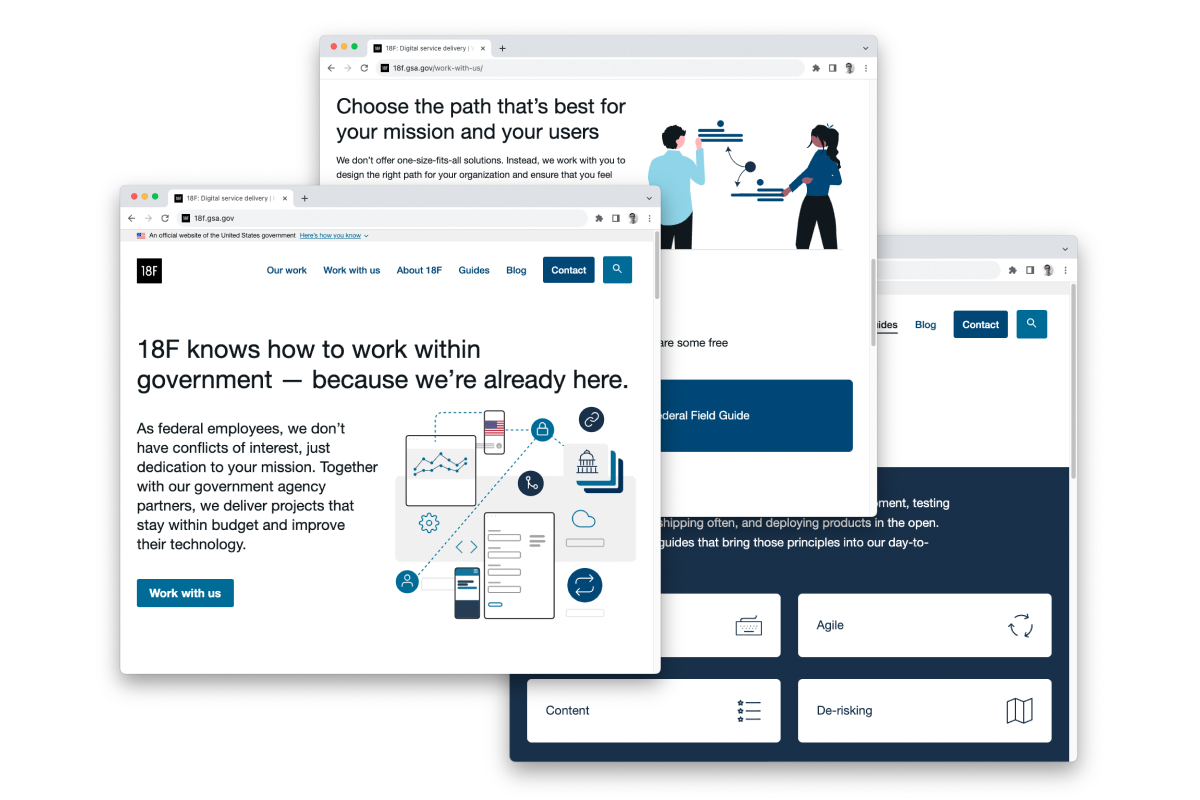
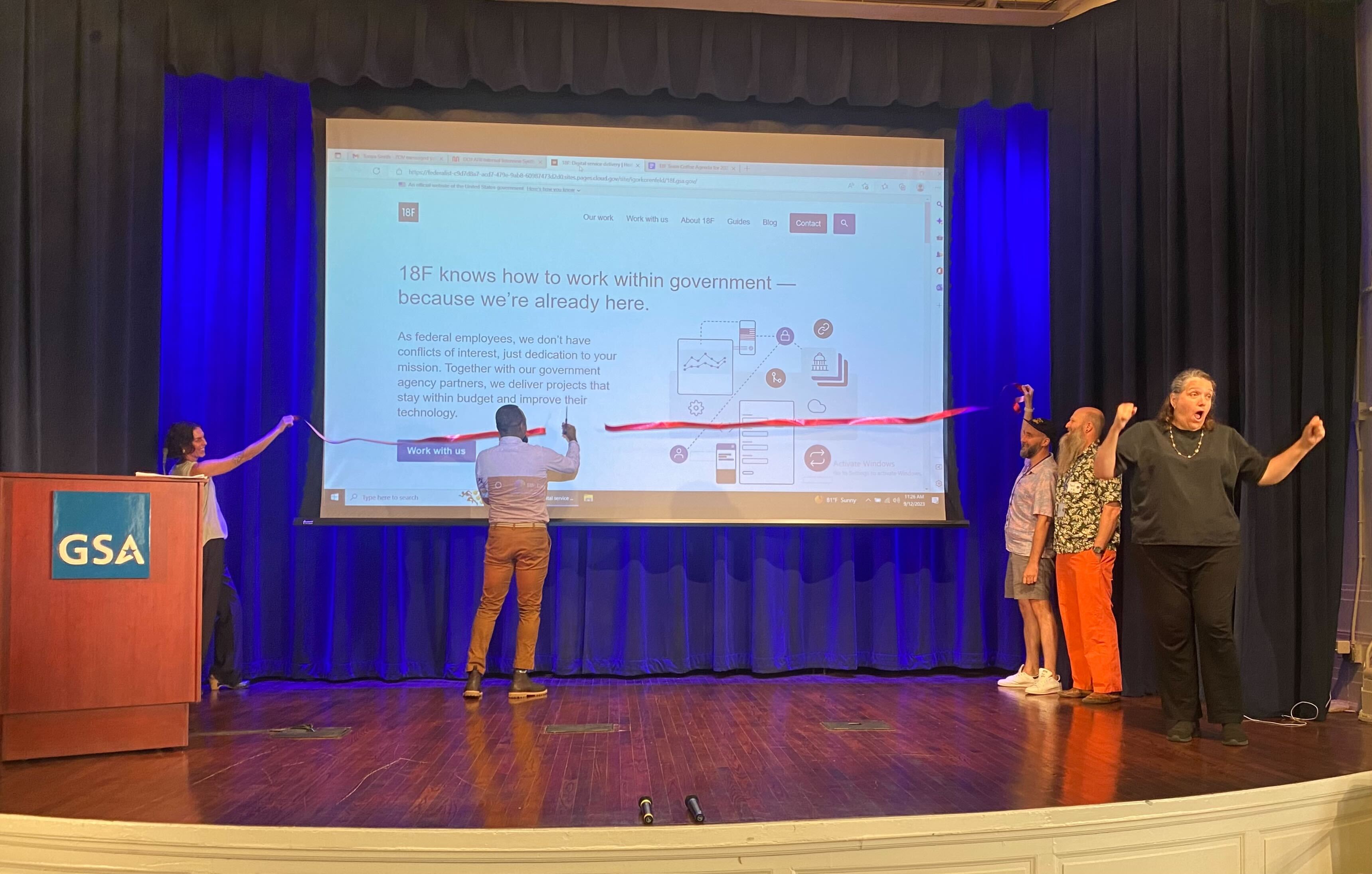
This past summer, we decided to refresh the 18F website. Since the last big redesign four years ago, we’d made a few tweaks, but not any significant changes. So why now?
The passage of time on its own isn’t a good reason to do a redesign. Changes in user or organizational needs should drive that choice. In our case, we realized the site no longer reflected our goals. Additionally, some of our designers had windows of time to work on parts of the site between client projects.
We also realized that we could use a small redesign to jumpstart an ongoing process of refinement, which we could pursue without disrupting other priority work.
We set boundaries
Our wish list of improvements spanned from ambitious to modest. We set aside those that would need a lot of research and discussion to settle on a solution. (For instance, we’d like to move the site to a new static site generator in the interest of sustainability. We decided it was out of scope for this refresh as that would entail more labor for set-up and content migration.)
We selected issues that were ready to move forward right away and that could be completed quickly or at a steady clip.
We rallied our resources
We figured out a process for coordinating a “tag team” of staff to organize operational work into small pieces, which then completed tasks in pockets of time between projects.
Two supervisors lead this work. They manage a backlog of issues in GitHub, collected from various sources. They also have standing meetings with leadership stakeholders.
Like all of our work at 18F, tasks are managed through agile methods. Daily syncs and blocks of time for coworking ensure everyone knows who’s working on what and can get help as needed. Biweekly planning meetings aligned priority issues to available skills. Biweekly retrospective meetings surface and remediate issues within work processes quickly. These processes make onboarding and offboarding staff routine and effective. (It also allows us to work on a range of priority work concurrently.)
We did just enough research
At the top of our wish list was to enable users to quickly find what they’re looking for. We also wanted them to easily understand our services and resources.
We started by digging into our existing trove of research. We knew from years of web analytics data what content our users search for the most and spend the most time on.
Interviews with our leadership team also clarified current organizational priorities and goals.
We did just enough design

As one would expect with a site “refresh,” we kept the amount of design to a minimum.
A couple of content designers reviewed the site’s information architecture and content. Informed by the 18F Content Guide, their recommendations led to clearer labels, more scannable copy, and a more consistent voice and tone across the site.
A product designer used the new copy to draft new page layouts, including a new blog post template, based on the U.S. Web Design System.
Thanks to that standing meeting with leadership, the new designs received quick attention and signoff. After a little refinement by a UX designer, they were handed off to a UX engineer to build.
Yes—a UX engineer. One thing that enabled us to refresh the site rapidly is that we intentionally hired several designers who can also code. Industry best practices are moving in this direction and we’ve also seen the benefit of having designers who can flex their skills as UX engineers. This gives us more agility to match people to projects based on appropriate skills and to ship projects quickly.
We (re)wrote just enough code
We run the site on a simple but nimble tech stack so that it can be maintained without highly specialized engineering knowledge. It uses standard web languages (HTML, CSS, and Javascript), an open-source static site generator, and cloud.gov Pages.
Since one of our goals was to continue to make the site easy to maintain and update, we took the time to carefully review the existing code to sort out what could be removed or streamlined.
Because the previous site also used the U.S. Web Design System (USWDS), translating the new designs into code required revising rather than writing new code. We used this site refresh as an opportunity to migrate to USWDS 3.0, to make use of its new modular approach.
Websites are living products

That’s how we launched a new 18f.gsa.gov in the course of several weeks. It wasn’t a simple process, but it was a steady one thanks to clear goals, disciplined decisions, and good coordination.
Next, we’ll plan and conduct user testing to assess how well the refreshed site serves our users’ needs and our goals. We’ll also continue to iterate based on FY24 goals and priorities. Whatever issues are identified will be addressed by available staff as opportunity allows. Based on what we’ve learned during this site refresh, future work sprints on the 18F website should be easier to coordinate and execute.
Websites aren’t meant to stand the test of time. They are a flexible medium that should serve their users’ needs and organizational goals. While that can seem like a monumental amount of work, identifying smaller tasks can help you publish and update your site at intervals you can measure in weeks or months rather than years.
With special thanks to the people who made the refresh possible:
Ron Bronson, Anita Cheng, Mel Choyce, Amanda Costello, Jennifer Damis, Jeff Durland, Austin Hernandez, Igor Korenfeld, and Michelle Rago

